As a small business owner or entrepreneur, your brand colors are more than just a stylistic choice—they are a powerful tool for communicating your brand’s personality, values, and mission. In the world of marketing, color can influence emotions, shape perceptions, and even drive purchasing decisions. That’s why, as a brand photographer in Sacramento, I always recommend understanding the psychology behind your colors and incorporating your brand colors into your brand photoshoot.

Why Your Brand Colors Matter
Why is this so important? Because cohesion is the cornerstone of a strong brand identity. When your colors, imagery, and messaging work together seamlessly, they create a unified experience that helps your audience recognize and connect with your brand instantly.
Think of your color palette as the glue that holds your visual branding together—whether it’s in your logo, website design, social media graphics, and brand photography.
Colors also have psychological effects that evoke specific emotions and associations. Understanding their meanings allows you to make intentional choices that align with your brand’s values and goals.
Quick Breakdown of Color Representations
- Red: Passion, energy, and confidence—great for bold, dynamic brands.
- Blue: Trust, professionalism, and calmness—perfect for industries like finance or wellness.
- Green: Growth, balance, and sustainability—ideal for eco-conscious businesses.



- Yellow: Optimism, creativity, and cheerfulness—works well for fun, approachable brands.
- Orange: Energy, enthusiasm, and creativity—suits brands that want to convey warmth and excitement.
- Black: Elegance, power, and modernity—perfect for high-end or minimalist brands.

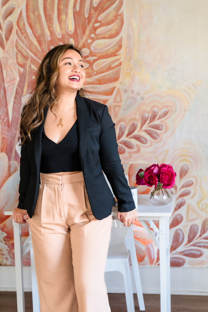

Bringing Your Brand Colors to Life in Your Brand Photoshoot
When you incorporate your brand colors into your brand photography, you create a cohesive and recognizable visual identity that resonates with your audience. I always encourage clients to use their color palette thoughtfully throughout their shoots.
Here are a few ways to bring your brand colors to life during a session:
• Props: Use items that match your color palette, such as notebooks, coffee mugs, keys, flowers to create subtle yet effective accents.
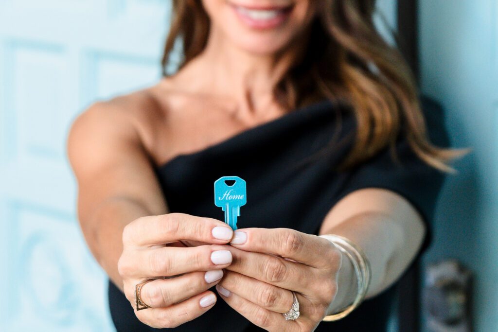

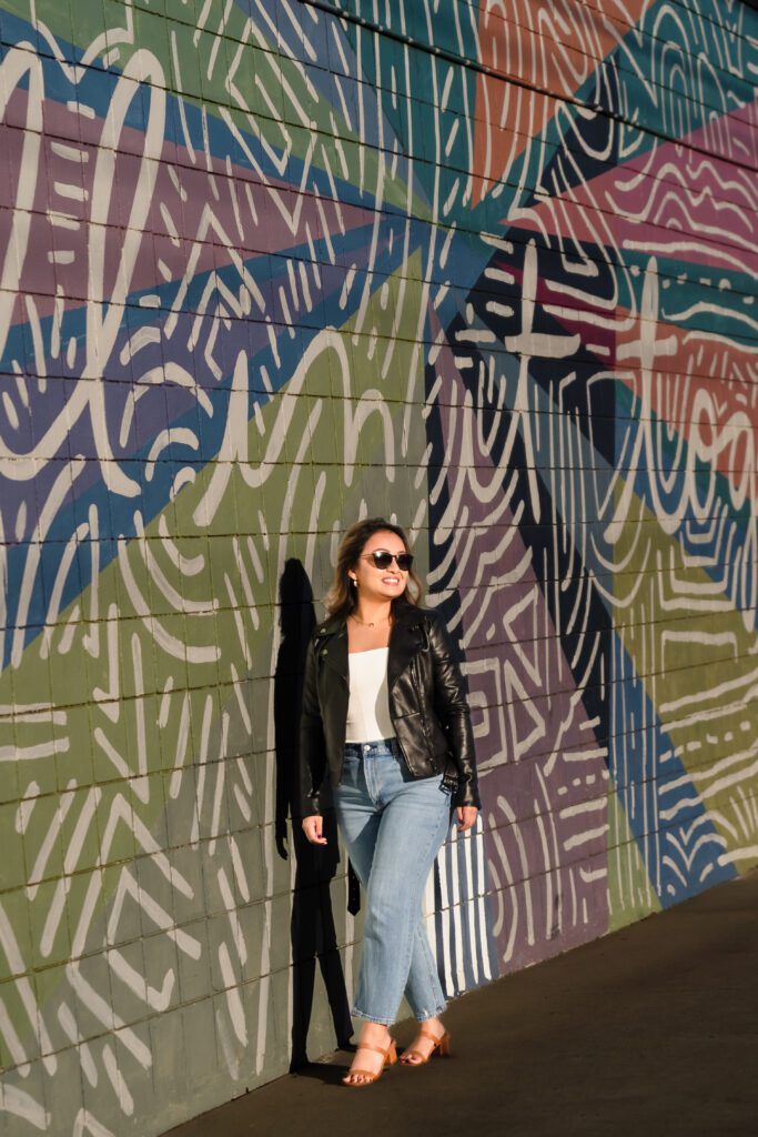
• Backdrops: Choose studios or locations with walls, furniture, or textures that align with your brand colors. For instance, a vibrant mural or a boho patio can showcase your brand’s mood.
• Outfits: Incorporate your brand’s primary or complementary colors into your wardrobe. For example, if your brand uses soft pastels, opt for a light pink blazer or a mint green scarf.
• Natural Elements: If your brand is eco-conscious, use greenery, wooden accents, or outdoor settings to emphasize your sustainability message.

• Details: Small touches, like branded stationery or packaging, can reinforce your brand’s identity in subtle but impactful ways.
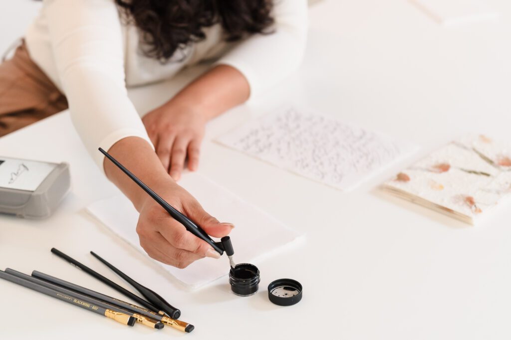

By thoughtfully integrating your colors into these elements, your brand photos will not only look cohesive but also reinforce the emotional connection you’re building with your audience.
Your brand colors aren’t just a pretty palette—they’re a powerful way to tell your story, connect with your audience, and make your business instantly recognizable. When your colors are thoughtfully woven into your brand photography, the result is more than just beautiful images—it’s a cohesive and impactful visual identity that truly represents you.
A well-thought-out color palette is a game-changer for any brand. If you already have one, that’s amazing—those colors can be seamlessly brought to life in your brand photoshoot, creating visuals that are as cohesive as they are captivating.
Ready to bring your brand colors to life in stunning brand photos? Get in touch, and let’s start planning it!
Xo,

+ view comments . . .